The report is intended for UX designers, UI designers, product owners, and engineers.
Over the past two years, I have spearheaded the development of a comprehensive CRM system tailored for franchise-based sports club management. While initially deployed for select clients in Australia, Singapore, and New Zealand, our trajectory is set for expansion across five continents following the turn of the new year.
Given the extensive breadth of functionalities within the system, our primary focus during the inception phase was the meticulous construction of its foundational components using React. Moreover, my responsibilities extended to crafting comprehensive documentation to accompany this framework.
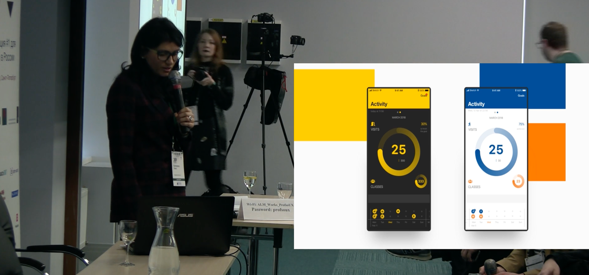
A key aspect of our development strategy involved integrating a 'white label' feature into the system. This entailed ensuring that all visual elements, including colours and fonts, dynamically adhered to the branding specifications of each client. To achieve this, I devised a systematic approach wherein clients select a singular colour representative of their brand identity. Subsequently, the entire system, including illustrations, dynamically generates a cohesive palette that harmonizes with the chosen colour scheme. This intricate calculation process is seamlessly integrated into our design system framework.
Speech plan
- Transaction Services Group. What the company does
- The product I worked on and why it is needed
- Development and system design (pitfalls and complexity of implementation) - Tips and Tricks
- What is 'white label' and how do UI design that you don't control
- The logic behind colour pattern design, one colour generates everything
- CRM UI differences between components, what to emphasise if the UI is forms and tables
- Conclusion, examples of interface with different brand colours, examples of other logic